Skew-Ts and Hodographs: An Orientation
Skew-T Diagrams and Hodographs, although extraordinarily confusing at first glance, are indispensable resources in analyzing the overall temperature and wind profile of an air column. In addition to a display of the temperature, dew point and wind at all levels of the atmosphere, a skewT diagram can be used to determine a number of convective indices used by forecasters to assess the potential for severe weather.
Skew-T
At least twice each day (additional observations are sometimes conducted during severe weather outbreaks) at various locations across the United States, an instrument package, called a radiosonde, is attached to a large balloon and released into the atmosphere. A small radio transmitter sends back information regarding temperature, pressure, humidity, wind speed and wind direction as the unit is carried aloft.
|
|
|
Annotated Skew-T Diagram from The Weather Center. |

This data is then plotted on a Skew-T Log-P diagram such as the example above from 12Z on November 4, 1998:
-
Isobars appear in gold and represent lines of equal pressure. The pressure level appears along the left side of the diagram and is represented in millibars.
-
Isotherms, shown in orange, represent lines of equal temperature and run diagonally from the lower left to upper right. The scale, in degrees Celsius, runs along the bottom of the chart and appears in green.
-
The Dry Adiabatic Lapse Rate is shown in green and represents the temperature a dry air parcel would reach as it ascends. The dry adiabatic lapse rate is a decrease of approximately 10° C per 1,000 meters of ascent
-
The Moist Adiabatic Lapse Rate shows the temperature a saturated air parcel would assume as it ascends, and is shown in purple. The moist adiabatic lapse rate is not constant, but is an average decrease of 6° C per 1,000 meters of increased height.
-
The Saturation Mixing Ratio, represented by blue dashed lines, is the ratio of the mass of water vapor to the mass of dry air in grams per kilogram. The values for this variable appear in yellow at the bottom of the diagram.
-
The Dew point Plot, in solid blue, is the vertical plot of the dew point temperature.
-
The Environmental Sounding appears in red and represents the temperature at the specified level of the air column.
-
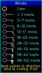
Wind direction and speed are provided in the form of standard wind barbs along the right side of the diagram.
-
Various Sounding Parameters such as convective indices are sometimes provided along the right side of the diagram.
Before a forecaster can use a Skew-T to determine the value of various convective indices, the pressure level of the Convective Condensation Level (CCL), the Lifting Condensation Level (LCL), the Level of Free Convection (LFC) and the Equilibrium Level (EL) must be identified. The National Center for Atmospheric Research (NCAR) offers an annotated diagram that provides this information at the calculated height along the left margin. See, for example, the NCAR skew-T from 12Z on February 16, 2006 (below).
 |
|
Skew-T diagram from 12Z on February 16, 2006 from NCAR. |
In the event that these parameters are not provided on the skew-T, it is a relatively straightforward task to determine them manually.
-
Lifting Condensation Level (LCL): the pressure level at which a lifted parcel reaches saturation. The LCL is identified by using the temperature and dew point at a specific pressure level. The intersection of a line drawn parallel to the mixing ratio line from the dew point, and parallel to the dry adiabat from the temperature, is the LCL.
-
Convective Condensation Level (CCL): the pressure level at which condensation occurs in an air parcel if the only mechanism for convection is heating. The CCL is found by drawing a line upward from the surface dew point, along or parallel to a mixing ratio line until it intersects the temperature line.
-
Level of Free Convection (LFC): the pressure level at which the lifted parcel becomes warmer than its environment, and therefore positively buoyant. The LFC is found by following the moist adiabat from the LCL until it intersects the temperature line. In stable air masses, there may not be LFC.
-
Equilibrium Level (EL): the pressure level at which a rising parcel becomes colder than the environment. The EL is identified by following the moist adiabat from the LFC until it crosses the temperature line.
A basic comprehension of atmospheric dynamics and a Skew-T diagram, enable meteorologists to determine the level of instability in an air column and assess the potential for an outbreak of severe weather.
Hodographs
Hodographs display the change in wind speed and direction (wind shear) at prescribed levels of the atmosphere on a simple polar chart (see below). In contrast to an actual hodograph, this instructional sample includes wind barbs of the observed wind at 1 kilometer intervals along the right side of the diagram. For simplicity, the wind speed is equal at all observed levels, while the direction changes from easterly at the surface to westerly at a height of 6 kilometers. The wind speed and direction are plotted as arrows, beginning at the center pointing in the direction that the wind is blowing and extending outward to the appropriate circle for the observed speed. Only the end points are plotted to prevent the hodograph from becoming unnecessarily cluttered. Once each of the observed levels are plotted, the hodograph is completed by connecting the end points.
 |
|
Hodograph sample from The COMET Program. |
The finished hodograph provides a quick representation of the wind shear above the observation site. In the example above, the wind veers (shifts in a clockwise direction) with increasing heights. However, the existence of constant wind speeds with increasing heights is highly unlikely. The two hodographs provided below are far more representational of actual vertical wind patterns.
 |
 |
|
Sample Hodographs from The COMET Program. |
|
When severe weather threatens, experienced meteorologists analyze hodograph patterns to assess wind shear, a necessary ingredient for the for the development of supercell thunderstorms and tornadoes.
Next: Synoptic Picture
Next: Ingredients for a Severe Thunderstorm
© 2005-2006 Mark A. Thornton